Wednesday, April 18, 2007


Thursday, November 02, 2006

Thursday, May 25, 2006

Sunday, May 07, 2006

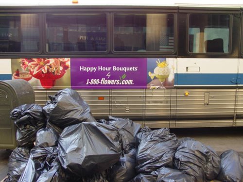
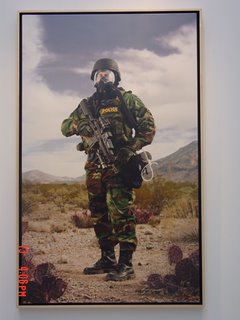
Paul Shambroom - Security series

The Paul Shambroom Security series photographs are disturbing and lightly humorous at the same time. Out of all the galleries the Paul Shambroom series was the only one to really catch my attention because it stuck with a general theme and visually commented on it. I believe that good photographs aren’t necessarily ones that have interesting composition and supplemental lighting, but are ones that say something about our society. As an artist/photographer Paul Shambroom makes a statement about what’s happening in America today, with the constant fear of terrorists’ attacks and war.
The most interesting thing about the pictures was how important the “subjects” are to National Security and how little we know, as citizens about their operations. It was uncomfortable trying to figure out what each piece of equipment was for and it almost scared me to think that there may be threats that the government is hiding that we don’t even know about as to not have the population panic. I also noticed that all the subjects were wearing protective suits and I felt naked watching it. I understand that if we were to be attacked with firearms or biological weapons that civilians wouldn’t stand a chance. Whether its paranoia or a sense of safety, even though I didn’t know what most of the equipment was for, I wanted it just to feel safe. The images of the destroyed cars were also very disturbing to watch because it reminded me of how fragile my body is. If the car didn’t stand a chance imagine the same bomb used in the middle of a large group of people. The “Breach” pictures were also very interesting because it made me think about how simple as something as a hole in a wall could cost people their lives.
I couldn’t tell if it was the funky colors of the suits or the awkward “superstar” poses that made the pictures amusing. The suits look uncomfortable, unorthodox and easy to tear, three things that I wouldn’t expect from a suit that is expected to save or protect someone’s life. It seems that Paul Shambroom also had these things in mind but was more focused on capturing the reality of terrorism than he was trying to be funny.
One thing that I did notice about the exhibition is that the pictures are very clean and organized. The subjects are also perfectly situated in the right positions. As a result of all this is that the images can never really feel too intense and scary because they are taken in a somewhat controlled environment. Only actual pictures of real police and bomb squads on the field, in action, can carry the true weight of war. Overall the pictures are well balanced and symmetrical. The subjects occupy just the right amount of space in picture. The colors work very well together and are easy on the eyes. The great thing about the gallery is that the pictures have the same overtone and feel to it no matter what the subject was. For example the pictures of the armored police had the same threatening feeling to it as the pictures of the hole in the wall.

Saturday, May 06, 2006

As the Art Director of my own campaign I would definitely choose Fulvio Bonavia as the photographer. His composition choice matches very closely what I had in mind for my ad. His eye level shot of the table is very well balanced. I like symmetry and balance and he seems to express these two elements very well. Being that he naturally has a similar photography style to what I tried to do for my ad, I'm sure he would be more knowledgeable and have better sense of what kind of lighting, layout and composition would work best. I appreciate his directness between camera and subject and removal of anything unnecessary.
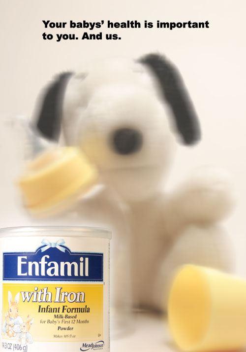
Revised ad - I only revised the tagline because of negative criticism. With this new tagline I kept in mind that parents are very skeptic about their children's well being, as well they should be, so I tried to be as understanding as possible. I was also thinking about something that said or included "We know because we're parents too." I felt that the "And us" was a little more straight forward and credible because you don't want people thinking that while they were making the formula there were a bunch of crying babies. The line I used says more that while the company is making the formula they are concerned about every ingredient that is put in. Not concerned as worried but concerned as in taking time, patience and dedication to produce the formula.

Sunday, April 23, 2006


Ad 2 - I like the concept of this ad very much but it didn't have the end effect that I thought it would. My sketch didn't include the bigger mp3player in the background but without it the concept of making the page the player didn't work too well. I'm actually surprised that I came up with the tagline; I was stumped for ideas on this one. Also the mp3 player as the page seems a bit too wide and distorted which is not how it really is. I can't decide if I'm satisfied with the result ad or if I just think the whole ad is worthless. (Same image from the first ad)

Ad 1 - I have no regrets here. Somehow though the pun that I wanted on the ipod is somewhat lost. You have to analyze the tagline to get it. The procedure wasn't that bad. I adjusted the curves to get the right overtone color of the player. Copied the layer a few times transformed them in different positions and that's it. The tagline "Not round and round" was hard to do. I had to do it in illustrator and import it because I don't know how to type along a path in Photoshop. I'm not too happy with the huge spaces between the tagline letters but I am satisfied with the end result.


This is the strongest photo that I've taken this week because it is a harsh reminder of the effects of war. These ribbons and tags are hanging from the church fence at the corner of 29th and 5th Avenue Manhattan. I work across the street and after work I decided to look at a few of the names and ages. The tag reads "The names of more than 30,000 Iraqi men, women and children who have died in the war are kept in the hearts of those that loved them. We pray for their memory." Personally I don't feel sad for those who have died because I have faith God will take care of them. What hurts me is the fact that we as humans continue to destroy ourselves and instead of fixing it we hang tags and make memorials. If we made a conscious decision to stop fighting and reason, Americans and Iraqi alike....Memorials and pictures like this would be unnecessary.
I am using my mp3 player for my ads.
For my 1st ad I want to take a picture of the player straight up at eye level. My final ad I want to make the player look like it's spinning in one place and the tagline will be "Not Round and Round" as a pun on the ipod. I personally bought my mp3 player opposed to an ipod because the scroll button just needs to be either tapped up or down as opposed to having to move your thumb around in circles like the ipod. I find the ipod method very annoying and so I decided to exploit that. I figure this quality would appeal to people who think like myself.
For my second ad I want to use the same picture I did for the first ad and make the page layout seem like the front of my mp3 player itself. I want to put the player on the page sideways about 3/4 up the page, and use the text in places that the actual player has text imprinted on it.
My tagline will be "Face the Music"
I hope that both ads will be clean white with very little shadows on the image. I also want them both to be well balanced and centered.

I think this is the best picture that I've taken this week because of the suddenness at which this picture hit me. I think the contradiction between the ad on the side of the bus and the heap of garbage bags is very funny. I got lucky with the lighting because the sun was coming down. What makes this picture special is that I was trying to do the same thing with the TGI picture and when I took the TGI photo I was disappointed because it wasn't as contrasting as I wanted and then I turned around and saw the bus and I was happy again. I definitely choose the bus and garbage over the TGI because the humor is clearer to understand.
If I had the choice I would hire Greg Shapps as the photographer for my ad because his use of lighting. I wanted the shots of my mp3 player to be bright and glowing as if shadow didn't exist. Chris Collins' work seems to be based on his use of shadows and dark to light gradient which is exactly what I didn't want to happen in my ad. I fought very hard to erase any hint of shadow from my shots. Greg Shapps seem to enjoy making every color stand out. I wanted this effect because my subject was generally different shades of a metallic blue color, so I tried to highlight each shade as much as possible. On the other hand Chris Collins seems to be satisfied only with shadows, which is an obvious bad choice for my ad.


I took this picture at work. The kid is one of my co-workers' son. I was trying to keep him company and so we were playing with my camera. It's the best picture I took this week because it's one of those "Kodak" moments I guess. He was signalling to me to press the button I think. If I could I would lower the camera a little to wipe out some of the unnecessary background. I think it's a great photo because it has a light hearted feeling to it, the same feeling you get when you are actually playing with a child.
The most interesting thing that I have learnt in today's class (Feb 14 2006) is that when photographing something you have to consider your environment and workspace very closely. This means that there may be something in the background or at the side that will entirely disrupt the photographing process and also make work harder later on during the toucup process. Before today I always just take the shot to get it out of the way and then try do everything else in Photoshop. This being said, it is much easier and effecient if the majority of work is done during shooting because even though Photoshop's possibilities are endless my skills with the program are not.
I find the Richard Foster photograph of the Green Classic Bently to be the most interesting use of light. http://www.billcharles.com/foster/richardfoster_15.htm The light is shot towards the seat of the car to welcome whoever is looking to the driver's seat. If he chose to position the light towards the Bently Symbol he would be highlighting only the fact that the car is a BENTLY! The light on the seats makes the viewer feel like he or she should be in the drivers' seat no matter what kind of car it is. The light also makes the viewer feel like when they actually do sit in it they be graceful yet powerful at the same time. The picture says that the car cannot move without the driver and that the driver is powerless without the car.
I find the Nicholas Eveleigh photograph http://www.eveleigh.com/site.htm of the half open First Aid Kit, (found in the Archives section) to be the most interesting. I feel like he's making fun of how much new medication is glorified in the USA. I say USA because the photo mainly uses red, white and blue which is very symbolic to the American flag and nation. It's arguable that he means to include Great Britain also because their flag also uses the same colors. Whatever country it may be he seems to be making a point that medicine is now becoming the holy secrets to life, that they are the answer to your prayers. This is suggested by the powerful white glow that resonates from the inside of the box. This technique is often used in movies and video games. He may not necessarily be making fun of how much we are glorifying man made medicine but may be just commenting on how powerful it has become and how fast it's power is growing.

Sunday, March 19, 2006


I find this picture so amazing. It's the subway from a different perspective. Often when I'm taking the Queens bound E or F train I stand at the front and peer forward. Just out of curiosity. The light in this picture definitely transforms the subject. Even though I was trying to take a picture of the traintracks or rather where they lead too, it would be impossible to even tell where I was if it wasn't for the platform lights. Somehow the image feels intense and nostalgic at the same time, also that the viewer is destruction-bound.

Taken during the last big snowstorm. This image has a lonely gloomy feel to it. It's kind of sad but the way the trees stretch up says everything will be fine when all this is over. I also like this picture because if it wasn't for the hardly visible houses in the back, it looks like something taken from a history book. Like what life was like before electricity in the 1500's.