Paul Shambroom - Security series
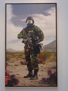
The Paul Shambroom Security series photographs are disturbing and lightly humorous at the same time. Out of all the galleries the Paul Shambroom series was the only one to really catch my attention because it stuck with a general theme and visually commented on it. I believe that good photographs aren’t necessarily ones that have interesting composition and supplemental lighting, but are ones that say something about our society. As an artist/photographer Paul Shambroom makes a statement about what’s happening in America today, with the constant fear of terrorists’ attacks and war.
The most interesting thing about the pictures was how important the “subjects” are to National Security and how little we know, as citizens about their operations. It was uncomfortable trying to figure out what each piece of equipment was for and it almost scared me to think that there may be threats that the government is hiding that we don’t even know about as to not have the population panic. I also noticed that all the subjects were wearing protective suits and I felt naked watching it. I understand that if we were to be attacked with firearms or biological weapons that civilians wouldn’t stand a chance. Whether its paranoia or a sense of safety, even though I didn’t know what most of the equipment was for, I wanted it just to feel safe. The images of the destroyed cars were also very disturbing to watch because it reminded me of how fragile my body is. If the car didn’t stand a chance imagine the same bomb used in the middle of a large group of people. The “Breach” pictures were also very interesting because it made me think about how simple as something as a hole in a wall could cost people their lives.
I couldn’t tell if it was the funky colors of the suits or the awkward “superstar” poses that made the pictures amusing. The suits look uncomfortable, unorthodox and easy to tear, three things that I wouldn’t expect from a suit that is expected to save or protect someone’s life. It seems that Paul Shambroom also had these things in mind but was more focused on capturing the reality of terrorism than he was trying to be funny.
One thing that I did notice about the exhibition is that the pictures are very clean and organized. The subjects are also perfectly situated in the right positions. As a result of all this is that the images can never really feel too intense and scary because they are taken in a somewhat controlled environment. Only actual pictures of real police and bomb squads on the field, in action, can carry the true weight of war. Overall the pictures are well balanced and symmetrical. The subjects occupy just the right amount of space in picture. The colors work very well together and are easy on the eyes. The great thing about the gallery is that the pictures have the same overtone and feel to it no matter what the subject was. For example the pictures of the armored police had the same threatening feeling to it as the pictures of the hole in the wall.
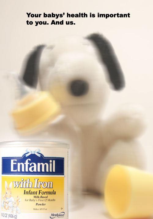 Revised ad - I only revised the tagline because of negative criticism. With this new tagline I kept in mind that parents are very skeptic about their children's well being, as well they should be, so I tried to be as understanding as possible. I was also thinking about something that said or included "We know because we're parents too." I felt that the "And us" was a little more straight forward and credible because you don't want people thinking that while they were making the formula there were a bunch of crying babies. The line I used says more that while the company is making the formula they are concerned about every ingredient that is put in. Not concerned as worried but concerned as in taking time, patience and dedication to produce the formula.