Sunday, April 23, 2006


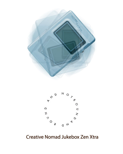
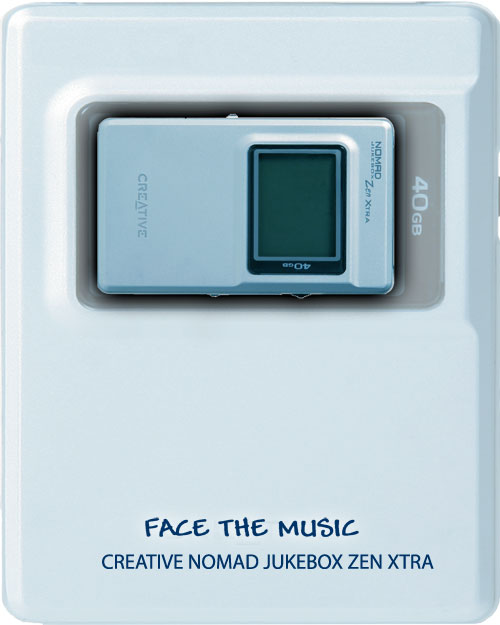
Ad 2 - I like the concept of this ad very much but it didn't have the end effect that I thought it would. My sketch didn't include the bigger mp3player in the background but without it the concept of making the page the player didn't work too well. I'm actually surprised that I came up with the tagline; I was stumped for ideas on this one. Also the mp3 player as the page seems a bit too wide and distorted which is not how it really is. I can't decide if I'm satisfied with the result ad or if I just think the whole ad is worthless. (Same image from the first ad)

Ad 1 - I have no regrets here. Somehow though the pun that I wanted on the ipod is somewhat lost. You have to analyze the tagline to get it. The procedure wasn't that bad. I adjusted the curves to get the right overtone color of the player. Copied the layer a few times transformed them in different positions and that's it. The tagline "Not round and round" was hard to do. I had to do it in illustrator and import it because I don't know how to type along a path in Photoshop. I'm not too happy with the huge spaces between the tagline letters but I am satisfied with the end result.


This is the strongest photo that I've taken this week because it is a harsh reminder of the effects of war. These ribbons and tags are hanging from the church fence at the corner of 29th and 5th Avenue Manhattan. I work across the street and after work I decided to look at a few of the names and ages. The tag reads "The names of more than 30,000 Iraqi men, women and children who have died in the war are kept in the hearts of those that loved them. We pray for their memory." Personally I don't feel sad for those who have died because I have faith God will take care of them. What hurts me is the fact that we as humans continue to destroy ourselves and instead of fixing it we hang tags and make memorials. If we made a conscious decision to stop fighting and reason, Americans and Iraqi alike....Memorials and pictures like this would be unnecessary.
I am using my mp3 player for my ads.
For my 1st ad I want to take a picture of the player straight up at eye level. My final ad I want to make the player look like it's spinning in one place and the tagline will be "Not Round and Round" as a pun on the ipod. I personally bought my mp3 player opposed to an ipod because the scroll button just needs to be either tapped up or down as opposed to having to move your thumb around in circles like the ipod. I find the ipod method very annoying and so I decided to exploit that. I figure this quality would appeal to people who think like myself.
For my second ad I want to use the same picture I did for the first ad and make the page layout seem like the front of my mp3 player itself. I want to put the player on the page sideways about 3/4 up the page, and use the text in places that the actual player has text imprinted on it.
My tagline will be "Face the Music"
I hope that both ads will be clean white with very little shadows on the image. I also want them both to be well balanced and centered.

I think this is the best picture that I've taken this week because of the suddenness at which this picture hit me. I think the contradiction between the ad on the side of the bus and the heap of garbage bags is very funny. I got lucky with the lighting because the sun was coming down. What makes this picture special is that I was trying to do the same thing with the TGI picture and when I took the TGI photo I was disappointed because it wasn't as contrasting as I wanted and then I turned around and saw the bus and I was happy again. I definitely choose the bus and garbage over the TGI because the humor is clearer to understand.
If I had the choice I would hire Greg Shapps as the photographer for my ad because his use of lighting. I wanted the shots of my mp3 player to be bright and glowing as if shadow didn't exist. Chris Collins' work seems to be based on his use of shadows and dark to light gradient which is exactly what I didn't want to happen in my ad. I fought very hard to erase any hint of shadow from my shots. Greg Shapps seem to enjoy making every color stand out. I wanted this effect because my subject was generally different shades of a metallic blue color, so I tried to highlight each shade as much as possible. On the other hand Chris Collins seems to be satisfied only with shadows, which is an obvious bad choice for my ad.


I took this picture at work. The kid is one of my co-workers' son. I was trying to keep him company and so we were playing with my camera. It's the best picture I took this week because it's one of those "Kodak" moments I guess. He was signalling to me to press the button I think. If I could I would lower the camera a little to wipe out some of the unnecessary background. I think it's a great photo because it has a light hearted feeling to it, the same feeling you get when you are actually playing with a child.
The most interesting thing that I have learnt in today's class (Feb 14 2006) is that when photographing something you have to consider your environment and workspace very closely. This means that there may be something in the background or at the side that will entirely disrupt the photographing process and also make work harder later on during the toucup process. Before today I always just take the shot to get it out of the way and then try do everything else in Photoshop. This being said, it is much easier and effecient if the majority of work is done during shooting because even though Photoshop's possibilities are endless my skills with the program are not.
I find the Richard Foster photograph of the Green Classic Bently to be the most interesting use of light. http://www.billcharles.com/foster/richardfoster_15.htm The light is shot towards the seat of the car to welcome whoever is looking to the driver's seat. If he chose to position the light towards the Bently Symbol he would be highlighting only the fact that the car is a BENTLY! The light on the seats makes the viewer feel like he or she should be in the drivers' seat no matter what kind of car it is. The light also makes the viewer feel like when they actually do sit in it they be graceful yet powerful at the same time. The picture says that the car cannot move without the driver and that the driver is powerless without the car.
I find the Nicholas Eveleigh photograph http://www.eveleigh.com/site.htm of the half open First Aid Kit, (found in the Archives section) to be the most interesting. I feel like he's making fun of how much new medication is glorified in the USA. I say USA because the photo mainly uses red, white and blue which is very symbolic to the American flag and nation. It's arguable that he means to include Great Britain also because their flag also uses the same colors. Whatever country it may be he seems to be making a point that medicine is now becoming the holy secrets to life, that they are the answer to your prayers. This is suggested by the powerful white glow that resonates from the inside of the box. This technique is often used in movies and video games. He may not necessarily be making fun of how much we are glorifying man made medicine but may be just commenting on how powerful it has become and how fast it's power is growing.